I haven’t included much of my MS work on my website but wanted to share on my blog one I was really proud of as we worked with a partner to provide a thorough usability test of the First Niagara Website.
Summary:
This Spring, our team of four RIT graduate students designed and conducted a task-oriented usability test of First Niagara’s website. Our goal was to identify potential usability issues and inform future website design.
Working with Janine Yagielski, the user experience manager of First Niagara Bank, we designed a plan that would require participants to explore the First Niagara Homepage.
Participants were asked to choose a banking product that they felt met the requirements given in our task scenarios. Once a product was selected, we then asked participants to fill out the credit card online application.

Nine participants were selected to participate after a screening process (see appendix for participant flyer and questionnaire). First Niagara Bank employees were disqualified from the study. All participants were recruited from the student body at Rochester Institute of Technology and were between the ages of 18 and 30.
Based upon our post-task and debriefing questionnaires, we felt that most users found the website easy to use and would be willing to use First Niagara’s site again. However, we did uncover some usability issues; especially in relation to the final submission of the online application that we hope will be helpful to First Niagara Bank.
While browsing the site users had difficulties completing tasks unless using the search functionality. Another prominent issue encountered was that some banking terms were not defined within the site, thus making it difficult for users with limited banking experience to understand the advertised features of the products.
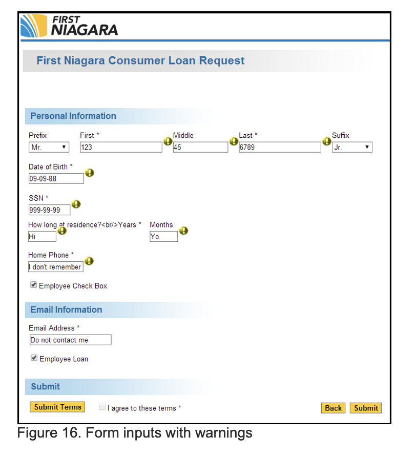
Regarding the credit card application, we found that users had problems figuring out the purpose of the “Branch” dropdown in the first screen of the application, in this case 100% of participants tried clicking on the disabled dropdown. Users also had trouble when trying to click on the “I agree” checkboxes on the first screen of the application, where, again, 100% of participants had issues figuring out that the PDF buttons should be clicked to enable the checkboxes.
One of the most important findings we uncovered was that after completing and clicking the “Submit” button on the Credit Card Application 100% of participants perceived that task was completed, without waiting for a final confirmation that would later appear on screen.